The Design tab
Everything about how the shop looks. In 3.3.0 this moved out of Settings and became a tab of its own, because styling your basket and naming your shop are not the same kind of job.
Three cards: Checkout styling, Basket icon and placement, and Preview your pages.
Checkout styling
This controls the buttons and the basket panel your customers see. Everything on it previews live in a small browser mock-up as you change it, showing the basket panel, a button on a product page, and the option pickers sitting above that button as they do on a product with variants, which are a Bang! Cart Pro feature.
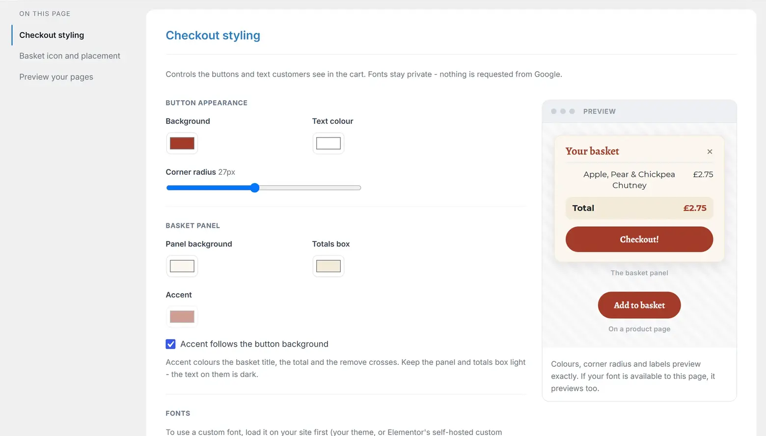
Button appearance
- Background and Text colour for your Add to basket and Checkout buttons.
- Corner radius, 0 to 60 pixels, with a live readout. 0 is a square button, 60 a full pill.
The radius applies to the controls beside your buttons as well, whatever height they happen to be - the quantity box, and the variant pickers that appear above the button on a product with variants (a Bang! Cart Pro feature). The rule is that the number you set is the number used, except that once you have asked for a pill, everything that should be round is round rather than a shorter control keeping square ends.
Basket panel
- Panel background and Totals box colours.
- Accent, which colours the basket title, the total and the remove crosses. Tick Accent follows the button background to keep them in step automatically.
Keep the panel and the totals box light. The text on them is dark and does not invert.
Fonts
Two separate choices: a Heading font for buttons and the basket title, and a Checkout text font for lines, totals and labels. Each offers the same five options: inherit from your theme's body text, Theme headings (Elementor) - which reads Elementor's heading font and quietly falls back to body text on any other theme - a system sans stack, a system serif stack, or a custom font you name.
Nothing is ever requested from Google. The plugin requests no fonts from anyone else's servers. Naming a custom font uses whatever your page already loads; if you want to be certain it appears everywhere, including the floating basket on pages that never use it, upload a font file and the plugin serves it itself, from your own site.
If the font you name is not available to the admin page, the preview says so plainly rather than pretending. That does not necessarily mean it is broken on your shop, only that this particular page cannot see it.
Button labels
Add-to-basket label and Checkout label. Renaming either updates every button across your shop at once, with no re-copying of shortcodes.
The sold-out label is not here. It lives with the stock counts it belongs to, on the Products tab.
CSS classes
A fold at the foot of the card lists the classes your theme or page builder can style directly, including .bangcart-add-to-cart, .bangcart-checkout, .bangcart-drawer, .bangcart-fab, .bangcart-price and .bangcart-sale-banner.
Basket icon and placement
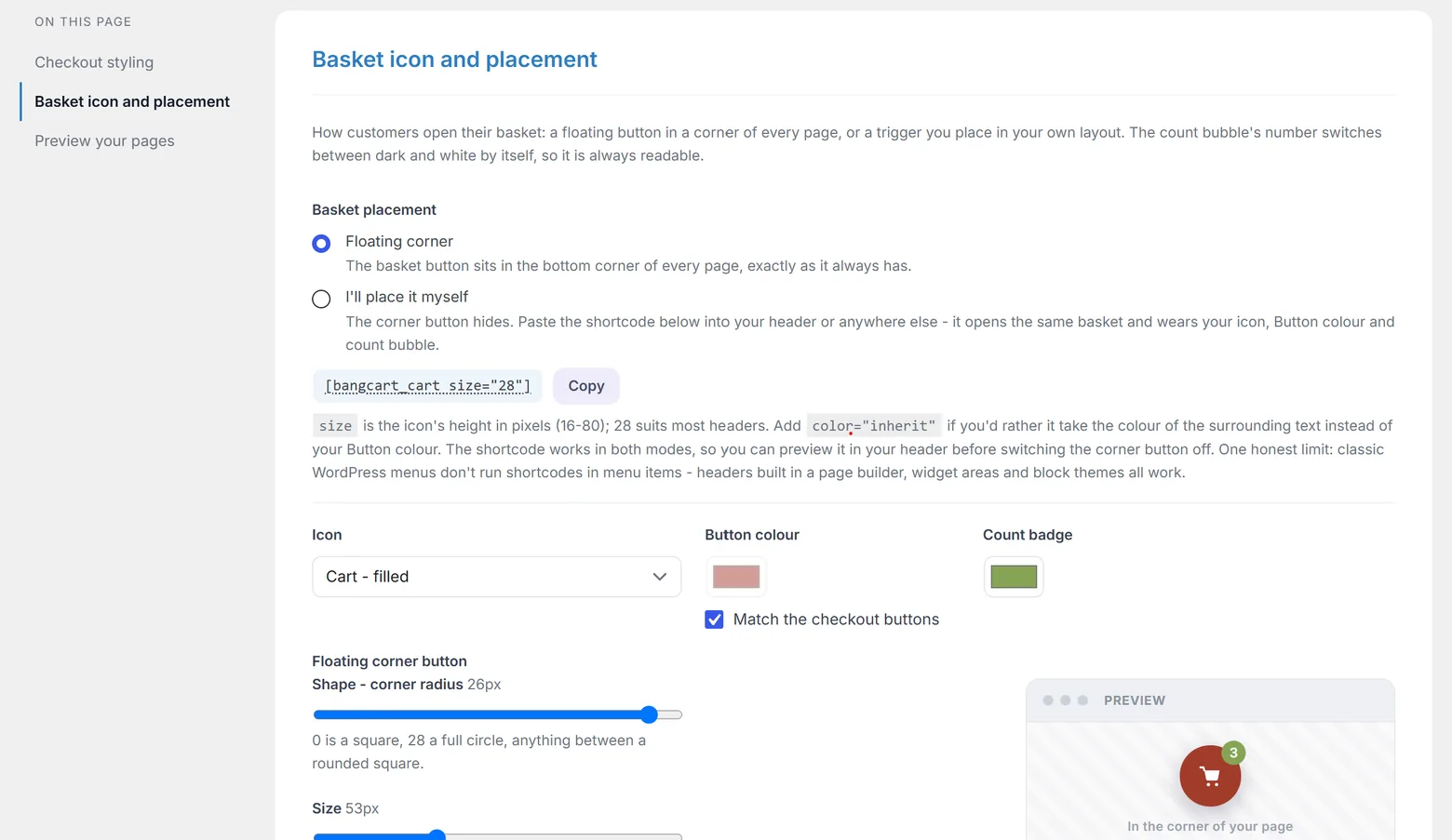
How customers open their basket. This is the card that decides what the rest of the styling means, so it leads with the choice.
| Mode | What happens |
|---|---|
| Floating corner | The default. The plugin puts a basket button in a corner of every page by itself. Nothing to place. |
| I'll place it myself | The corner button hides. You paste [bangcart_cart size="28"] wherever you want it. The basket, drawer and overlay all stay exactly as they were. |
The shortcode works in both modes, so you can put it in your header and look at it before committing. There is a Copy button right beside the radios.
The corner button's look
- Icon: cart, bag or basket, each in outline or filled.
- Button colour, with a Match the checkout buttons tick.
- Count badge colour. The number inside switches between dark and white by itself so it stays readable.
- Shape, a corner radius from 0 to 28. 0 is a square; 28 is a full circle at the default size, and softly rounded corners on a larger button.
- Size, 40 to 80 pixels. The icon and count bubble scale with it.
- Position: Bottom right, Bottom left, Middle right or Middle left.
Bottom left is the escape hatch when a chat widget owns the right corner, and the natural corner for right-to-left sites. The two middle options give you a side tab, vertically centred.
The basket panel always slides in from the right, whichever corner the button holds. On a phone it is 340px wide but capped at 88% of the screen, so it covers nearly everything and the question barely arises.
The page overlay
While the basket is open, the page behind it is dimmed. The Page overlay control, in its own section beneath the floating button settings, chooses the colour of that tint and its Strength, from 0% (no dimming at all) to 90%, in steps of 5. It stays live in both basket placements, because the overlay dims the page whichever way the basket opens.
A fresh shop ships with the deep indigo the basket has always used, at 45%, so nothing changes until you choose otherwise. It saves with the rest of the basket settings.
What dims in self-placed mode
Choose I'll place it myself and Shape, Size, Position and their framed Preview panel all quieten, because they sit with the floating button's settings. Icon, Button colour, Count badge and the Page overlay stay live, because your placed trigger and its basket wear those too.
The dimmed controls are made inert rather than disabled, and that distinction is doing real work: a disabled input drops out of the form when you save, and the plugin would then fall back to defaults for anything missing. So disabling them would silently reset your shape, size and position on every save made in self-placed mode. Inert blocks interaction while the values still ride along.
If you switch to self-placed and the plugin cannot find [bangcart_cart] on any published page, it says so, gently, because a customer with items in their basket would have no way to open it. If you have placed it somewhere the scan cannot see, the note is safe to ignore.
Preview your pages
Six buttons, each opening a real page in a new tab with an example order built from your own products. Nothing is charged, nothing is saved, and nothing is sent to Stripe.
- Order confirmation, the thank-you page as a customer meets it, inside your theme. This one needs a thank-you page nominated on the Settings tab first.
- Order status, the page a buyer reaches from their confirmation email, and Order status (posted), the same page after you mark the order posted.
- Mark as shipped, the page you land on from your own seller email. Its button is deliberately dead in a preview.
- Order status (collection) and Order status (collected), the buyer page worded for a collection order - before and after you mark it collected.
These call the real page renderers rather than a mock-up, so what you see is what will happen.
Still stuck?
Write to me and it is me who answers, not a ticket queue. Tell me what you expected and what happened instead.